Custom Fields
Introduction
Custom fields are essential to the system when using a module to store items such as a customer, a task, or a piece of equipment. Each individual item's information is stored in a custom field. For instance, the name of a customer, the status of a task, or the price of an invoice are all stored in their respective custom fields.
The Different Custom Fields
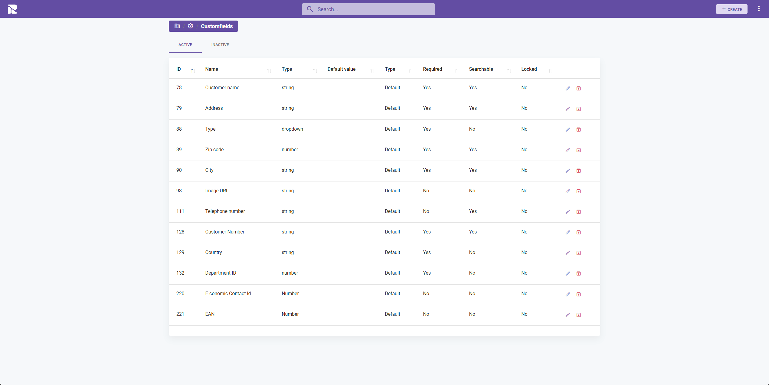
Custom fields vary in appearance and behavior. They are listed in the fields menu and can be installed from a fields app. New fields can be added, and existing ones can be edited as needed.
Create and Edit Custom Fields
Follow the steps below to create or edit customfields:
- Select the module you wish to create/edit a customfield for.
- Navigate to "Settings".
- Choose the "Customfields" option.
- Click on "Create" or edit an existing one.
Configuring a Custom Field
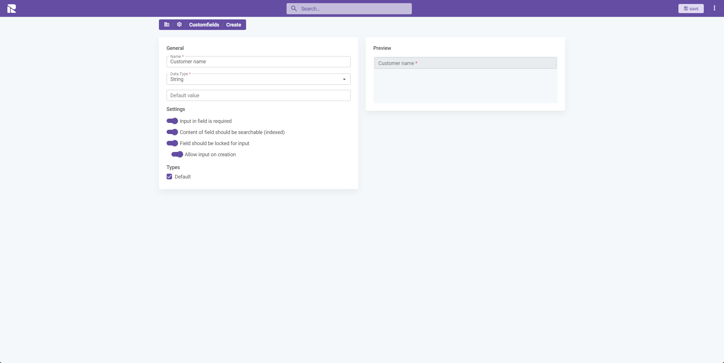
After initiating the creation of a new custom field, you'll need to provide the following information:
- Name: Specify the name of the field.
- Data Type: Choose the type of field (e.g., text, number, date).
- Default Value: Choose whether a default value should be applied every time an item using the custom field is created.
- Input in Field is Required: Specify if a value in this field is required when creating/editing an item.
- Content of Field Should be Searchable (Indexed): Specify if you want users to be able to search for values in this field.
- Field Should be Locked for Input: Specify if the user should be allowed to add values to this field (typically used if another system manages this field, e.g., reference number).
- Allow Input on Creation: When the prior checkbox is selected, you can allow the user to input values, but only when the item is created.
- Types: Specify which types this custom field should be included in.
Configuring Multi-Option Fields
Some custom fields contain multiple options for the user to choose from, requiring further configuration, such as:
- Dropdown
- Checkbox
- Radio
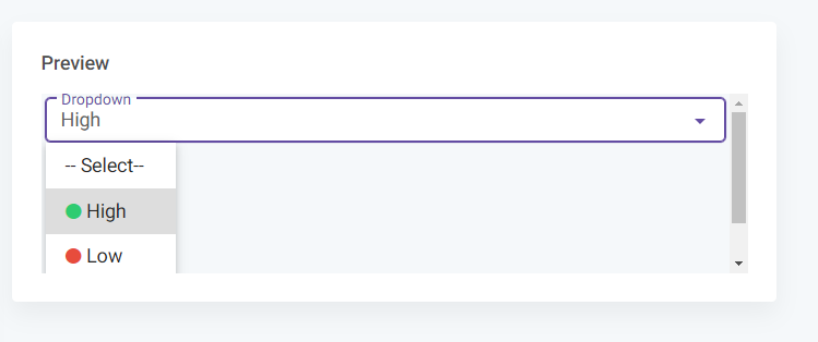
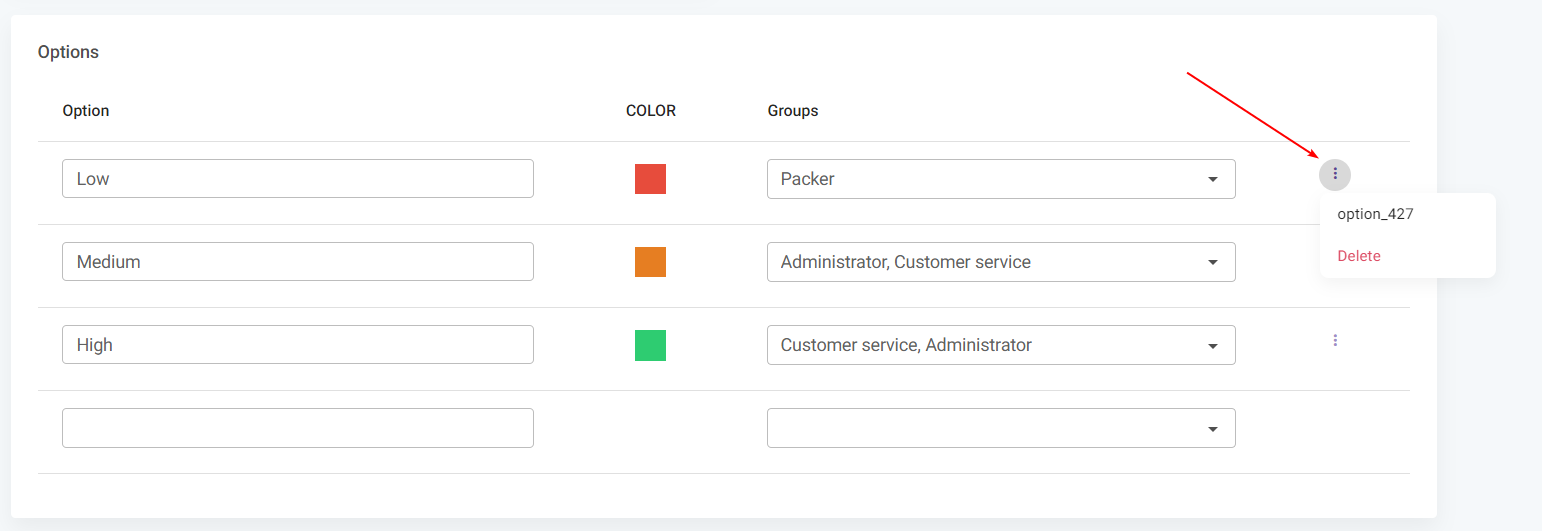
For instance, a dropdown may have three options for the user to choose from:
- Option: Add the value that the user will be presented with.
- Color: Choose an optional color for the specific option.
- Group: Choose which permission groups are allowed to select the given option.
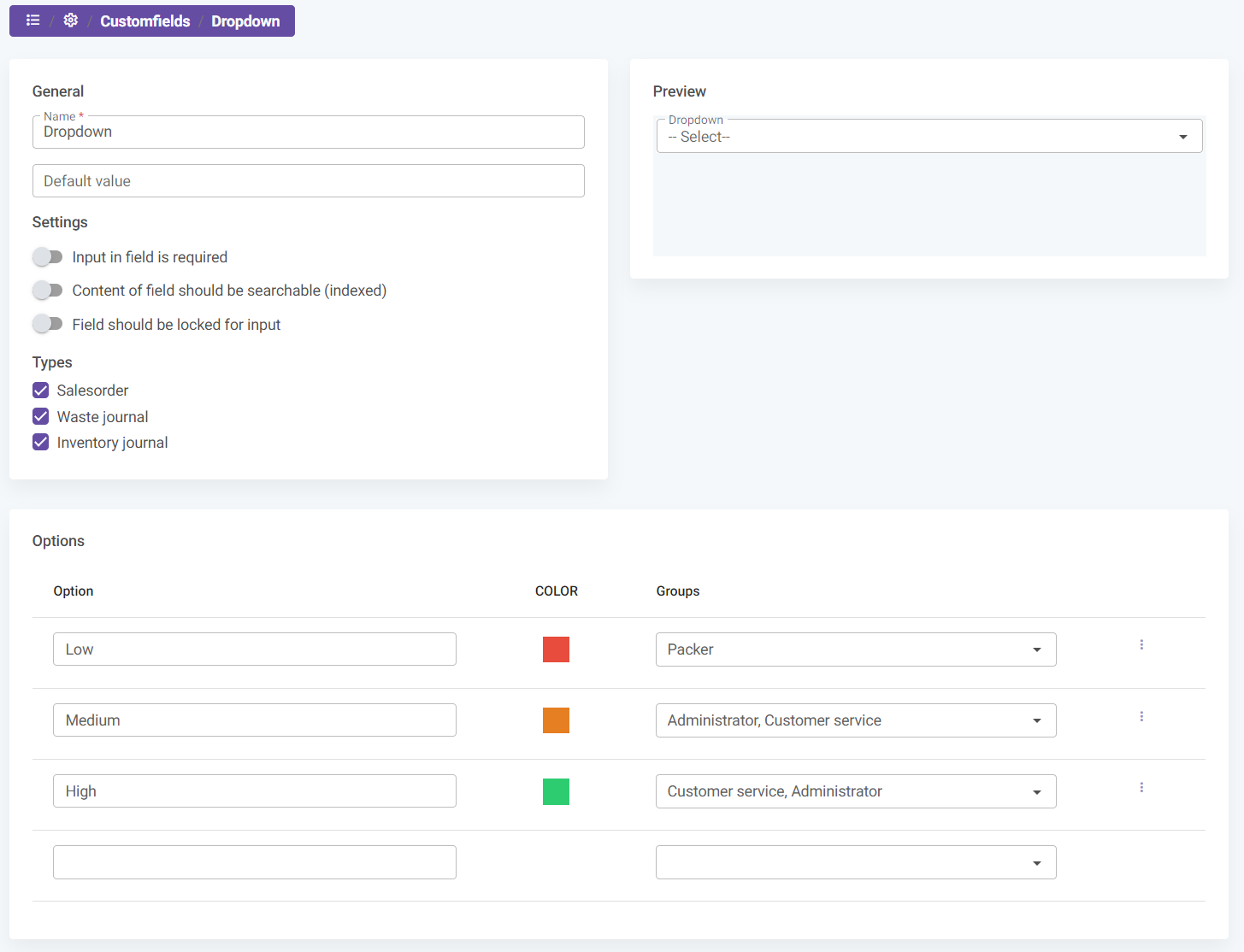
Deleting an Option Value
Option values can be deleted through the 3-dot menu beside the option. The value of the option is also displayed, which is useful when creating queries based on this custom field.
Preview
You can see and test the field behavior on the right side of the screen. This feature allows you to ensure that the custom field functions as intended before finalizing.