Fields Overview
Each form page contains a fields component that defines user input areas. Each field supports specific types and configurations.
Structure of fields
| Property | Type | Required | Description |
|---|---|---|---|
key | object | No | Unique identifier for the field. |
options | object | No | Display name of the field. |
html | object | No | HTML content to be displayed. |
note
html is a special property that allows you to add HTML content to the form. I can't be used with key or options at the same time.
key properties
| Property | Type | Required | Description |
|---|---|---|---|
id | string | Yes | Unique identifier for the field. |
label | string | Yes | Display name of the field. |
labels | object | No | Translated versions of label. See page about languages |
required | boolean | No | Specifies if the field is mandatory for form submission. |
fieldtype | string | Yes | The field to be used. |
defaultValue | string | No | Default value of the field. Can reference a custom field, a post value, or be a fixed string. |
getOptionsFrom | string | No | Fetches options from a specific field. |
Field Types & Configuration
Basic Field Structure
{
  "key": {
    "id": "field_id",
    "label": "Field label",
    "required": false,
    "fieldtype": "text | number | float | finance | email | phone | ...",
    "defaultValue": "optional default value"
  }
}
Default Value Variants
- Empty: No
defaultValueprovided. - Fixed: A static value (e.g.,
"My default",42). - Dynamic: Uses a placeholder like
[project.cf1234].
Example Field Types
Text Field
"fieldtype": "text",
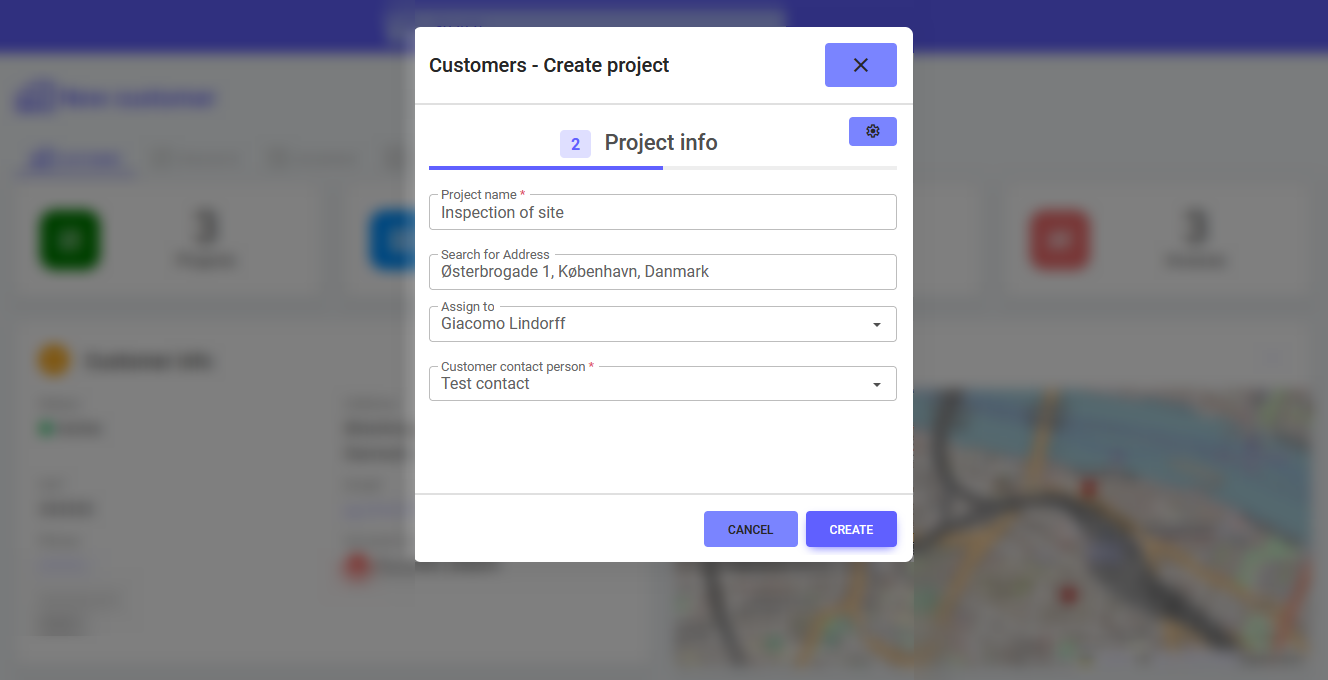
"defaultValue": "Inspection of site" // or [project.cf1234]
Number / Float / Finance
"fieldtype": "number" | "float" | "finance",
"defaultValue": 12345 // or [project.cf5678]
Email / Phone
"fieldtype": "email" | "phone",
"defaultValue": "user@example.com" // or [project.cf9101]
Option Fields
Used for dropdowns, radio buttons, or checkboxes.
Shared Option Structure
"options": [
  { "id": "1", "value": "Option 1" },
  { "id": "2", "value": "Option 2" }
]
Types
dropdownradiocheckbox(supports multiple selections)
Example Configuration
"fieldtype": "dropdown",
"defaultValue": "2"
Date and Time Fields
"fieldtype": "date" | "clock",
"defaultValue": "2024-01-01" | "[datenow]" | "[timenow]" | "[project.cf...]"
User & Group Fields
Allow selecting users, groups, or both. Can include metadata restrictions.
Metadata Example
"metadata": {
  "allowUsersFromGroups": "group_inspectors"
}
Address Lookup Fields
Integrated with map services and allows toggling specific address parts.
Show/Hide Related Fields
"metadata": {
    "showFieldLatitude": false,
    "showFieldLongitude": false,
    "showFieldCountry": false,
    "showFieldCity": false,
    "showFieldZip": false,
    "showFieldStreet": false,
    "showFieldFormattedAddress": false
},
Prefilled Values
"valueFieldCity": "[project.cf691]"
HTML Fields
Used to add custom display elements in forms.
Example
{
  "html": {
    "tag": "h3",
    "label": "Project Section",
    "labels": {
      "da_dk": "Projektafsnit",
      "pl_pl": "Projekt sekcja"
    }
  }
}